In 2023, I set out to watch every one of Hitchcock's surivivng movies. The goal was to learn as much as I could about visual storytelling from a master director.
This is an ongoing project.
The Farmer’s Wife (1928)
This comedy, adapted from the stage, has some genuine laugh-out-loud moments. Hitchcock himself felt it contained “too much dialogue.” While plays do tend to lean much more on speech for their storytelling than movies, in my opinion The Farmer’s Wife strikes a great balance.
The humor is visual to its core, at times even Chaplain-esque. The dialogue, to me, serves only as a comedic flourish. The way these characters talk might read as old-timey to today’s viewer, but I think even in the 1920s it was meant to feel over the top in its backwater formality.
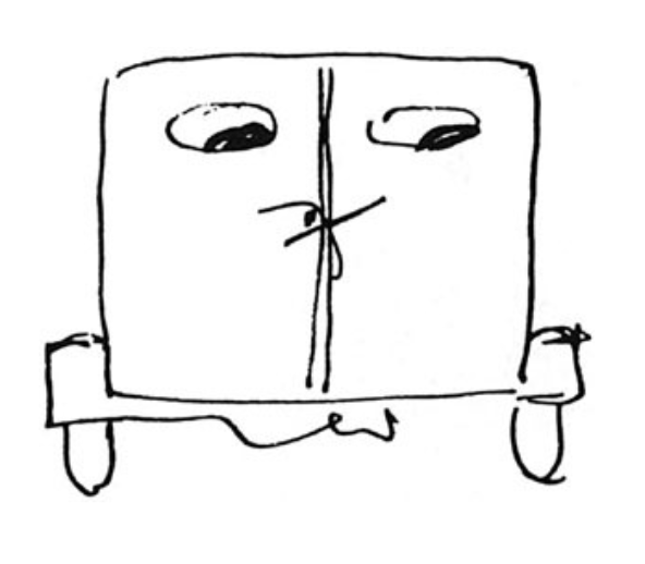
Our protagonist is a widowed farmer who decides he should put an end to his loneliness and find himself a wife. Hitchcock takes his time in the first act, establishing the cast of characters and dwelling on the farmer’s loneliness, before giving us the following scene to bridge us into act two. In it, the farmer and his servant make a list of prospective wives.
A few scenes earler, Hitchcock established the empty chair as a symbolic representation of the absence of his wife:
To show the ghostly images of potential suitors in that same chair perfectly externalizes the farmer’s inner thoughts.
It's worth mentioning that the humor here is pretty wonky and sexist. The farmer’s unchecked, almost frothing horniness is definitely part of the comedy, but it doesn’t excuse the film’s objectification of women, nor is his chauvinism ever adequately confronted in the third act.
Other Visual Touches
When our farmer finally proposes to the nervous Thirza Tapper, the Jell-O mold she’s holding telegraphs her emotional response.
It reminds me of the water shake moment in Jurassic Park — a small but effective way of making visual what might otherwise be too subtle on screen.
When our farmer has finally struck out with all the women on his list, he resorts to hitting on the town's bartender. Their chatter is punctuated by a shot of thirsty patrons.
Oddities
There’s a moment where we cut between two angles on the farmer that feel just a bit too similar, at least to my eye.
This cut felt jumpy. While I think it technically passes the 30 degree rule-of-thumb, the shot sizes and framing may have been slightly too similar for the cut to be seamless.
Champagne (1928)
Hitchcock uses repetition to keep stories legible across time jumps. Champagne, rough though it may be, provides a ton of functional examples.
According to Bruce Block, juxtaposed images communicate through variation in contrast and affinity. What changes, and what stays the same? Those elements we choose to carry into a new shot, and those elements we lose, together dictate the meaning of a cut. When it comes to affinity, it seems to me there’s no simpler strategy than repetition.
The Power of Repetition
After our protagonist boards a cruise ship, an employee shows her a map of the vessel. We then fade from the map to the actual door.
What is Hitchcock telling us with these 3 shots? It’s simple: “Now she’s staying aboard the ship.”
Perhaps this dissolve would have worked on its own, but I believe that the “B46” label does a lot of heavy lifting here, because its repetition provides an even simpler unit of meaning: “The room she’s about to enter is also aboard the ship.”
This seemingly trivial clarification is in fact crucial to the story, as her arrival on the ship was less than traditional (she was rescued from a sinking plane in the middle of the Atlantic). Cutting to her in the room might have left us confused as to whether or not we’re still on the ship.
Part of what makes Hitchcock such a great teacher is how simple his messaging is. He doesn’t try to say anything complicated. Communicating the simple stuff is complicated enough.
Here’s another example: When her father’s fortune runs dry, the heiress gets a plan to sell her jewelry to make ends meet.
Again, a key object persists between shots. In this case, the satchel. What simple statement is Hitchcock making with this repetition? The sequence in its entirety tells us one thing: “She’s lost the last of her riches.”
But if we zoom in momentarily on the fade between the purse (open, and then closed), I think we can find an even simpler unit of meaning: “There’s a bunch of valuable jewelry in that purse.”
This simple statement sets up the stakes for the robbery. Yes, she could have just told us there was jewelry in there – but our hearts wouldn’t have sunk when the man started following her, and we wouldn’t have felt the loss as viscerally.
Hitchcock also uses repeated objects to highlight the passage of time, as when the heiress’ making of the bed turns into her setting of the table.
There’s a clear pattern here. With the map/door cut, the numbers stay the same but the thing they’re labeling changes. With the purse, it’s open then it’s shut. With the sheet, what she’s throwing through the air starts as a blanket, and ends as a tablecloth.
In each of these transitions, something is notably different in the second shot – and that difference, coupled with the repeated object, conveys meaning.
One transition in particular reveals just how far we can stretch the concept of “repetition.”
We cut from a note, given to her by a well-meaning acquaintance, to that same man’s front door (which we’ve never seen before). The repeated object here is nothing more than a shape – a white rectangle, to be exact – but it tells us everything we need to know: “She is now at the door of the man who wrote that note.” (Presumably because she is in need of a friend.)
Each of these transitions conceals (or showcases) a passage of time, and each takes care of exposition – whether it’s establishing the setting (the boat), the stakes (the satchel), or motive (the note).
I’m really coming to admire Hitchcock’s efficiency. But to be efficient, you first need to know what you’re trying to say. Usually, that coincides with what the audience needs to know at any given moment.
Hitchcock never assumes we understand what’s going on. He knows it’s his job to tell us.
The Manxman (1929)
The Manxman is a tale of two best friends who fall in love with the same woman. How do you telegraph unaired conflict between two supposed allies? Hitchcock’s solution is to create visual separation between the men, using every tool available to him…
Creating Separation
1. Camera Movement
This is the first time the love triangle is introduced to us, so Hitchcock makes sure we take note.
Instead of showing Christian and Pete in a two-shot, we see them from Kate’s point of view – which drifts from one to the other in a pan. The two men suddenly occupy their own separate frames.
2. Staging
In an effective use of deep staging, Christian spies Kate and Pete chatting across the bar.
The distance between them (emphasized by extras and depth of field) helps us understand that Christian feels left out.
3. Blocking
Christian inserts himself between Pete and Kate in the frame, going so far as to put a hand on his friend and physically separate the couple.
It’s subtle, and justified by the logic of the scene, but it works subconsciously – for both us and for the character.
4. Physicality
Having to be present while your friend hits on your crush through her open bedroom window is a bummer.
Having him literally stand on you while he does it makes it all the worse.
5. Props
The two play checkers, while awaiting the doctor’s word on Kate’s newborn baby.
Even a half-hearted board game can showcase that the two are on opposite sides of an issue – even if one of them is yet unaware.
Together again…
Pete, having been abandoned by Kate, now seeks the advice of his best friend.
For Christian, the gravity of his own betrayal has finally hit home, and he guiltily grips his grief-stricken friend. They are on the same side once again.
Blackmail (1929)
Courage!
It is, undeniably, a prerequisite for creating something new. When there’s money at stake; when the thing you make may be seen (and judged) by others; when it might not work out the way you’d hoped.
Writing your first feature script, or directing your first short, or pursuing a new career.
These might not sound all that scary from the outside, but there’s something experientially dangerous about doing something new – it requires courage.
I wonder if Hitchcock was anxious when making Blackmail. It must have been nerve-wracking, knowing that the main actress, Anny Ondra, “hardly spoke any English,” and that in this pre-dubbing era they’d need to have another actress “standing outside the frame, with her own microphone, while miss Ondra pantomimed the words.”
There’s a lot of potential there for things to go wrong, especially as this was Hitchcock’s very first sound film.
And so, in this instance, I can’t help but feel drawn to learning from Hitchcock’s courage rather than his technique. After all, I’m sure plenty of film scholars have discussed, at great length, how he elevates this portrait of a troubled woman – who kills a man in self-defense – into the subjective experience of paranoia itself.
How Hitchcock sets up the man’s lifeless hand as both a literal and symbolic representation of the murder…
…How the image of the hand is then repeated to show what our heroine is thinking…
…How paranoia twists what she sees…
…How the knife follows her around even in casual conversation…
Yes, I’m sure all of that has been discussed to death.
What I’d rather learn from is Hitchcock’s daring. In his own words:
The producers decided it would be silent except for the last reel…. But since I suspected the producers might change their minds and eventually want an all-sound picture, I worked it out that way. We utilized the techniques of talkies, but without sound. Then, when the picture was completed, I raised objections to the part-sound version, and they gave me carte blanche to shoot some of the scenes over.
We used the Shuftan process because there wasn’t enough light in the museum to shoot there. You set a mirror at an angle of forty-five degrees and you reflect a full picture of the British Museum in it…. The producers knew nothing about the Shuftan process and they might have raised objections, so I did all of this without their knowledge.
Alfred Hitchcock, Hitchcock/Truffaut
Those are the words of someone who not only understands the art of filmmaking, but also the art of taking chances.
It’s important to note that Hitchcock never expected to win every battle:
The ending I originally wanted was different…. But the producers claimed it was too depressing.
Some things you just don’t have control over. In other matters, you do your best to courageously take charge.
How do you get that kind of courage? I don’t know, but it certainly doesn’t come from asking nicely; nor does it necessitate haphazard bravado (Hitchcock planned his work meticulously).
Maybe courage comes from making an informed decision, and then executing without hesitation. That seems like a good place to start.
Murder (1930)
I'm starting to get an idea of how Hitchcock creates suspense.
He raises a question.
He promises an answer.
He makes us wait for that answer.
He ups our curiosity while we wait. (optional, but effective)
Some examples from Murder (1930)...
The Scream
He raises a question. By opening the movie with a woman's scream, he makes use wonder: what caused the scream?
He promises an answer. We're presumably moving towards the source of the scream, so we know we'll eventually arrive at it. (Imagine if the people opening their windows were exclusively out them in the opposite direction of our movement. This wouldn't create as much suspense, because we wouldn't know feel like we were moving towards the scream's source).
He makes us wait for that answer. The camera's slow track across the windows forces us to sit in the mystery.
He ups our curiosity. The banging on the door. The neighbors' reactions. The barking. It all serves to increase the intensity, and our curiosity.
Getting Dressed
He raises a question. Having been woken up by the racket, these two characters are desperate to find out what's going on.
He promises an answer. The two are in the process of getting out the door so they (and we) can find out what the commotion is about.
He makes us wait for that answer. Before they can get out the door, they first have to get dressed. She has trouble getting her foot through the leg hole, making us wait even longer.
He ups our curiosity. Voices outside the window increase in intensity as they dress, culminating in a second scream.
The Crime Scene
He raises a question. What is everyone looking at?
He promises an answer. The camera roves about the space, promising to reveal what was concealed in the wide shot.
He makes us wait for that answer. The panning and tilting are deliberately slow.
He ups our curiosity. The crowd's stunned silence tell us they're looking at something horrible. Even the policeman is frozen in shock.
The Box Office
He raises a question. What does the note say? Apparently even a pedestrian question will create some suspense if we're made to wait for the answer.
He promises an answer. The note is center frame, and we're tracking right towards it, so we know we'll eventually be able to read it.
He makes us wait for that answer. The push-in is painfully slow.
He ups our curiosity. People stroll across frame, obstructing our view as we get closer.
What is suspense?
First we discover that there is something to know. Then we come to know it. Suspense is, like this mid-sentence clause, what happens in between.
The Skin Game (1931)
Puns are a great springboard for creating visual meaning. Hitchcock often takes an idiom that describes what’s happening in the story, and then makes that idiom literal on screen.
We see a small example of this in The Skin Game. An impoverished couple, fearing they’ll lose their home, make a desperate plea to local baron Hillcrist.
One idiom for what’s happening here is that these locals are coming to Hillcrist, “hat in hand.” As though to hammer this dynamic home, Hitchcock literally puts the man’s hat in his hands.
Hitchcock’s work is full of visual puns like this.
He even admits, in Hitchcock/Truffaut, to a flubbed example in The Lodger (1927). It occurs near the beginning of the film, in a moment where Hitchcock is trying to articulate that everyone in town is keeping their eyes out for a serial murderer.
I showed the back of a small London news van. The back windows are oval. There were two men sitting in the front, the driver and his mate. You see them through the windows – just the tops of their heads. And as the van sways from side to side, you have the impression of a face with two eyes and the eyeballs moving. Unfortunately, it didn’t work out.
Alfred Hitchcock, Hitchcock/Truffaut
Not all visual puns will succeed. But the ones that do can contribute to a sort of subconscious visual layering that helps drive home the purpose of the shot.
If we know what we’re trying to say with a shot, we can point to that message with multiple layers of visual meaning. The more that everything in a shot points to one singular message, the better chance we have of articulating the information the audience needs to know.
Each beat of the film should convey a single, vital piece of information. To that end, visual puns are just one more tool at your disposal.
Although it shares with every other tool a crucial prerequisite: Before we can effectively communicate something to the audience, we must first know what it is we’re trying to say.
Rich and Strange (1931)
This severely underrated comedy contains tons of hilarious and inventive visual gags.
An untraveled young couple receives a surprise inheritance, and decides to see the world. After an extravagant night in Paris, our two drunken tourists stumble back into their hotel lobby and make their way to the elevator.
This gag occurs at the end of a long night out. It is the final of many reminders that they're unfamiliar with, and unequipped for, world travel.
Without a bit of dialogue, it effectively establishes what will become the story's primary dilemma: they're in over their heads.
Waltzes from Vienna (1934)
Power imbalance is a great accelerant for conflict.
Strauss is a young composer who lives in his father's shadow. His girlfriend, Resi, wants the elder Strauss to give his son's music a chance. Resi stands in the doorway, waiting for the elder Strauss to finish conducting.
Visually, the power imbalance is clear. Hitchcock's use of contrast to elaborate the difference in status between Resi and the elder Strauss brings the tension of this moment to life.
Height - The elder Strauss stands on a podium. She stands on the ground.
Blocking - She hovers in the background by the door, unsure of herself. He stands in the center of the room, his purpose unwavering.
Size - Compared to the elder Strauss, she appears small in the frame.
Spaciousness - The long vertical lines on the wall between them paint her into a much narrower frame than the composer.
Motion - Strauss makes big, exaggerated motions, while she remains still.
Angle - She faces Strauss, while he is turned away from her, unaware of her presence.
Clothing - Against the elder Strauss' conducting outfit, her outfit appears flowery and unserious.
Color - Everyone else wears something dark. She wears white.
Every choice here stems from the emotional truth of the scene's protagonist, Resi, at this exact moment. Her nerves are magnified by the frame.
Marnie (1964)
A few quick observations on this psychological thriller.
I’m reminded not to be afraid to reframe a shot, mid-take. It won’t bug the audience, as long as it’s motivated by a character’s movement – even if it’s only a side character, as in this case.
Continuing on in the same scene, this cut felt strange:
Usually when we cut closer to someone in dialogue, we also move closer to their line of subjectivity – nearer to looking them straight in the eye. But in this case, the cut actually moves us further from the character’s eye line.
Was this intentional? I don’t know. Charitably, this cut was meant to highlight that fact that we want to know more about this dark-haired woman, but that she keeps us at an arm’s length. Uncharitably, this was a mistake (in the film days, there was no playback, so maybe they just didn’t nail the second angle). Either way, it certainly had an effect on me.
Speaking of odd angles…
These two angles remind me of the variation that’s possible in a simple shot-reverse-shot. Though they’re facing each other, Hitchcock had our two main characters turn their bodies away, emphasizing the gulf between them.